Translating a booklet into a robust and engaging site
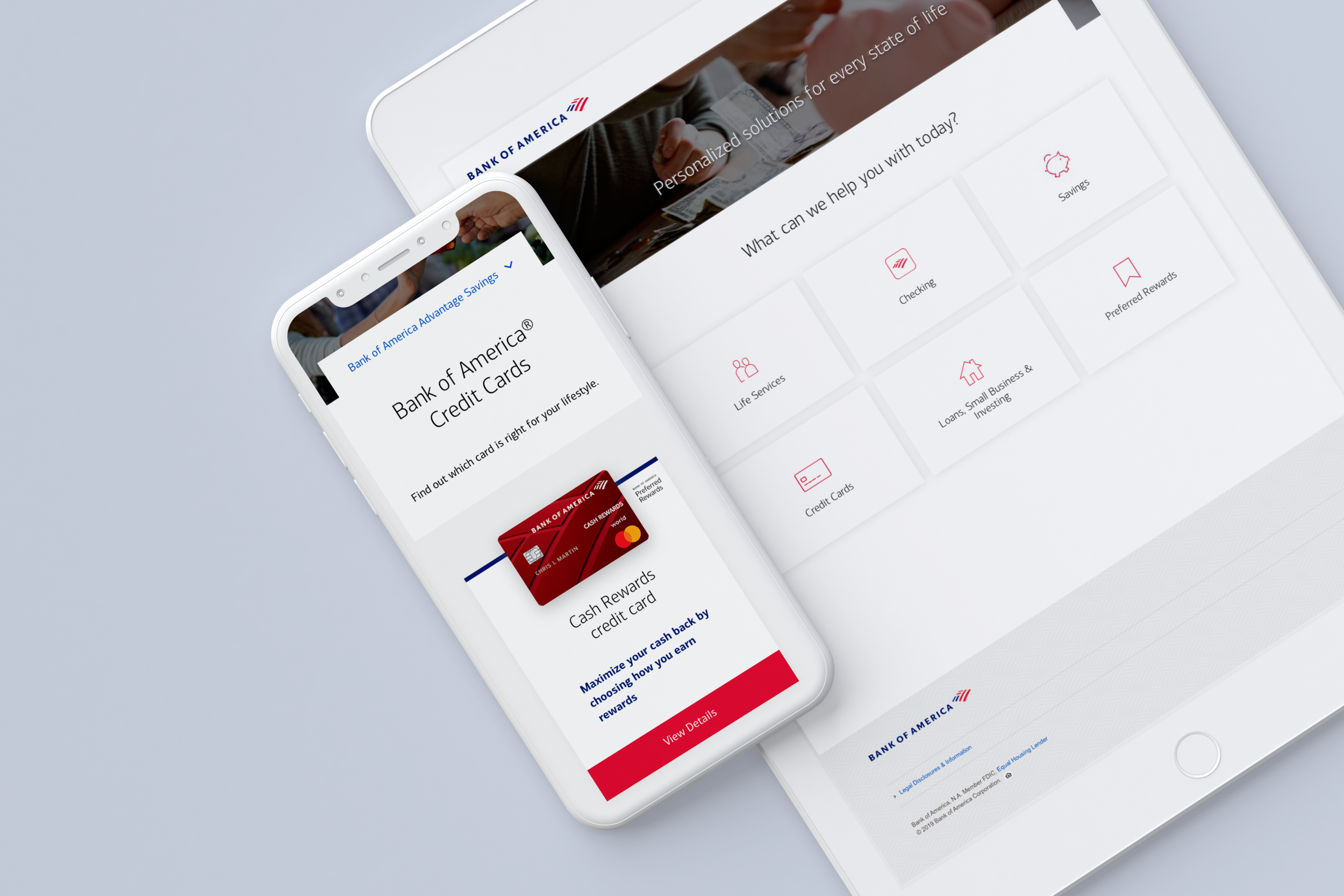
Bank of America needed a digital, responsive version of their print booklet that currently lives in financial centers. They are used by bank associates to explain BAC products and offerings. The new site is displayed in iPads and on associates’ monitors during client (and prospective client) meetings.
The ask: Provide associates with an easier and more engaging format to help their clients further visually understand the Bank’s unique products and services, with opportunities to link out to tools and calculators within the experience.
Agency: Digitas
Timeline: A 6 week design process for the brunt of the designs. Currently live in select centers in Charlotte, NC. Rolling out across all financial centers in 2020.
Team: I was the sole designer for this project, overseen by a design manager. Our team also included 2-3 project managers, a developer and a tech lead.
Preview
Before: The Print Booklet
Here are a few pages from the booklet I translated into this microsite. It was designed by an agency called TPN and passed off to us with rigid requirements of sticking to as similar of a layout as possible, since the booklet (proximity of copy to specific products) had already been approved by Legal. (The joys of corporate design)
Taking cues from a past project
To preserve consistency, I took the grid, components and ideas for the basic structure of the site from a previous project I worked on, the About site for Bank of America. The site is being developed currently, and it was a great starting point especially for the tight timeline for this specific project.
After: A full-fledged microsite
Here are select pages from the site. Note: Mobile screens were passed off to dev as mid-fidelity, so some of the icons and copy are for placement only.
Results
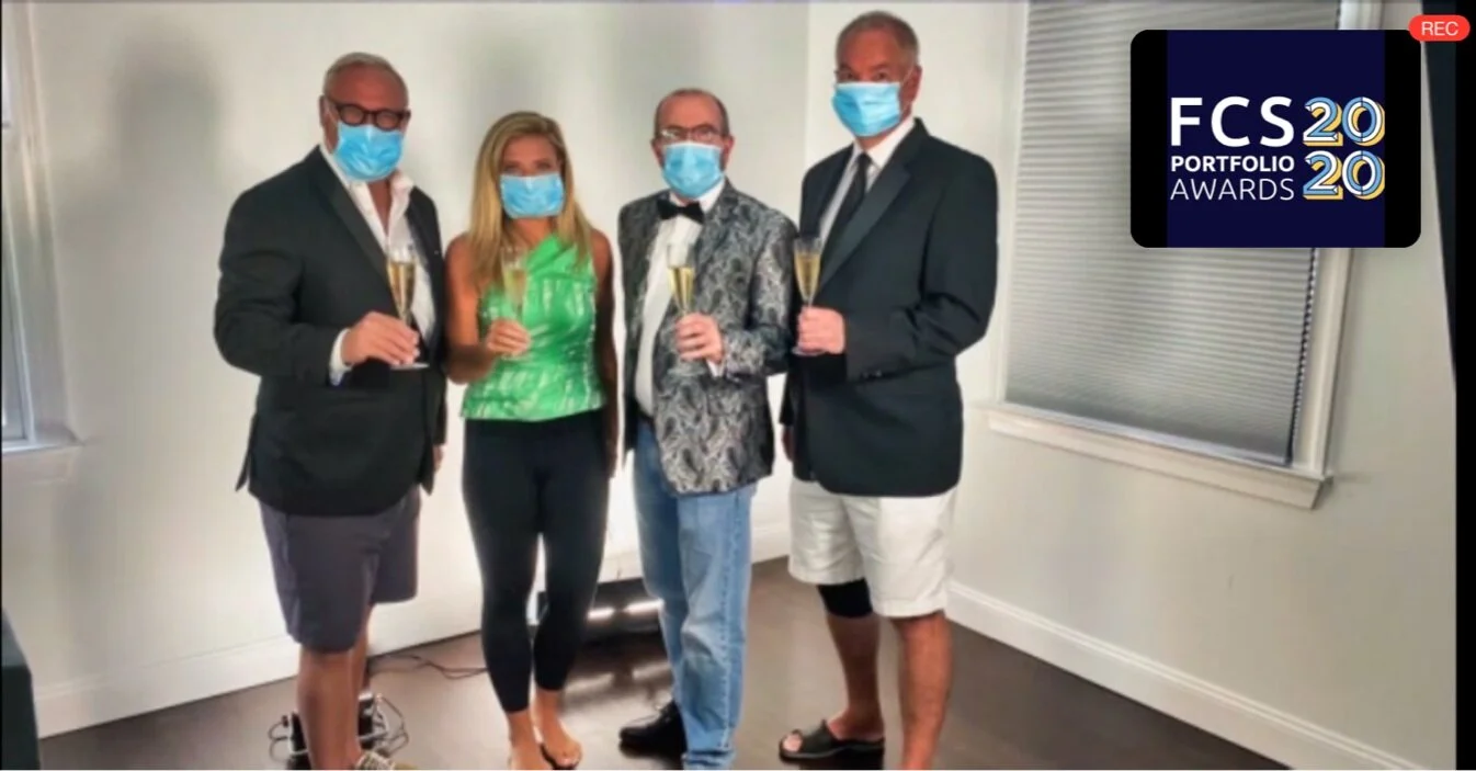
Clients were extremely pleased with the site throughout the making of it. So much so, that they wanted to enter it to a design competition, the Financial Communications Society Awards. We attended the Virtual Awards Ceremony on Zoom this past August, and even ended up winning Gold in our category! Other agencies who entered included Grey, Anomaly, McCann, Ogilvy and Havas, who are all heavy hitters, so it felt like a great achievement.
So far, clients have communicated to us as well that the sales associates currently using the site all love it and think it is a vast improvement from the print booklet.
covid-era zoom ceremony


