Role: Junior Product Designer | Head of Product: Rich Tong
Fohr is an influencer marketing platform and agency.
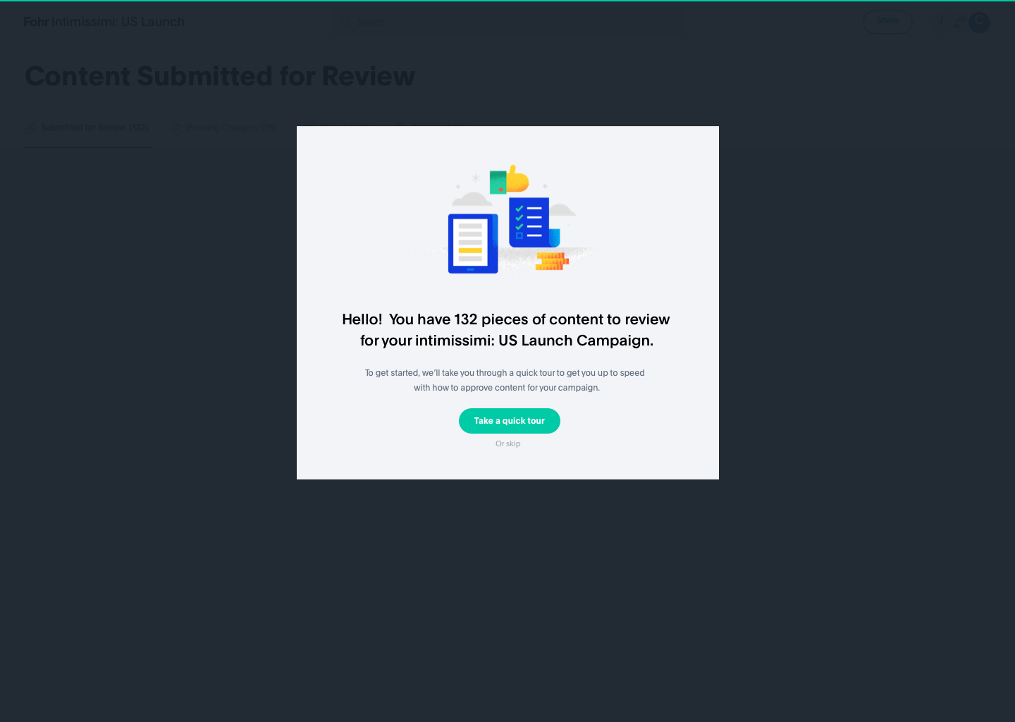
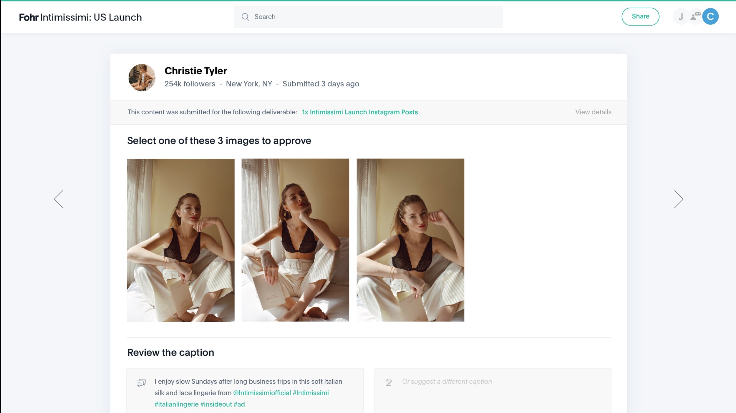
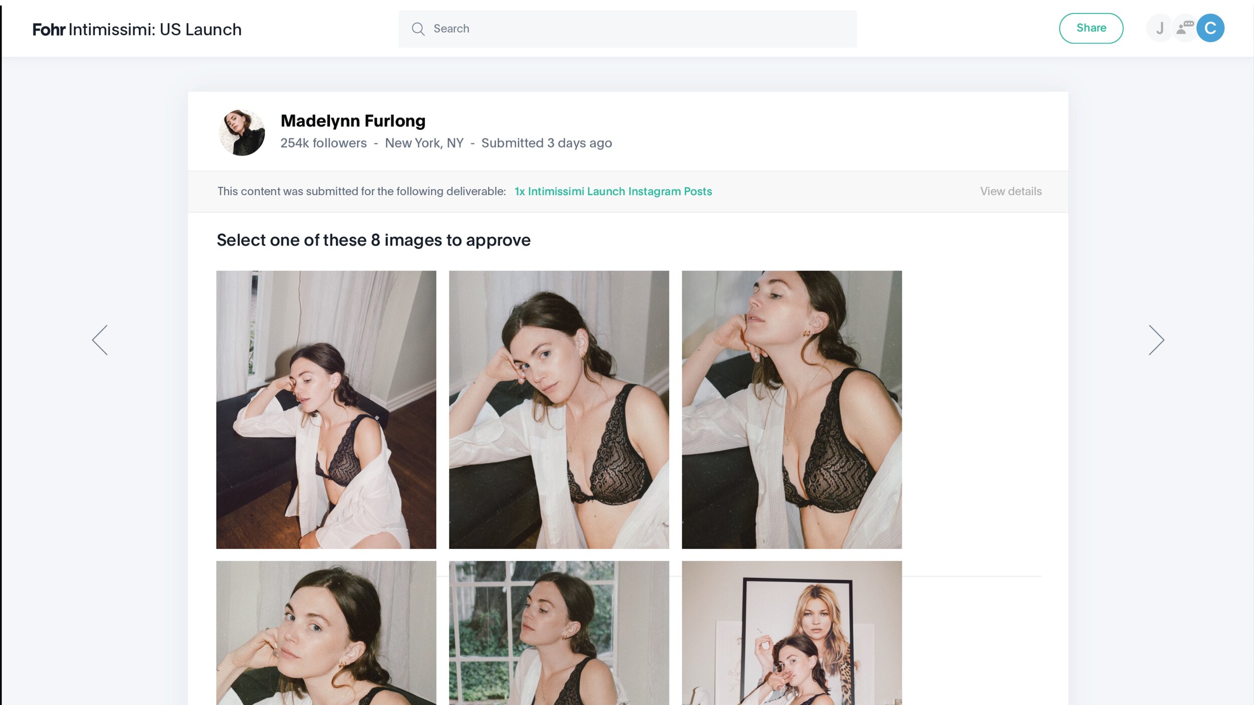
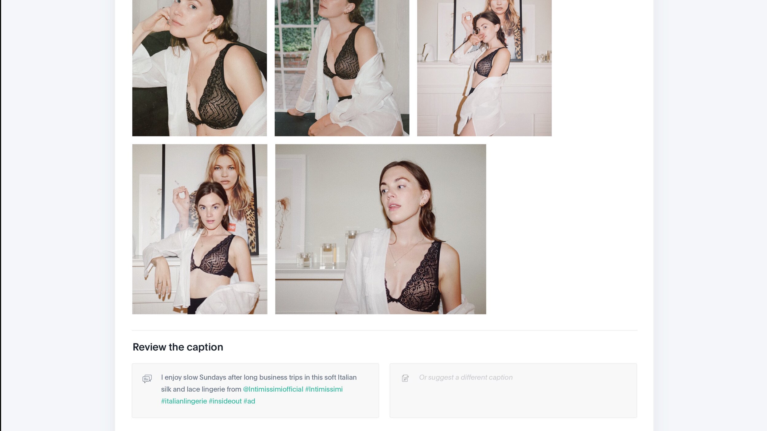
We were launching an exciting new product called the Content Approval System. The old way of getting our influencers’ content approved used to all be done in a tangly web of excel sheets and emails. This was a product we needed to simplify getting our influencers’ content out the door and approved much more efficiently.
I worked on the Gallery Format and Dashboard themes, while we were exploring themes to go with for the Brand users. After we nailed that down, I designed the Influencer user view .
This was a highly accelerated project because we wanted to scrap the old design + design a new one in the original project’s timeframe. Despite the intensely shortened timeframe, it has been a success and one of my favorite projects to look back on. It has also saved our account managers and customers countless hours of time per week. Excel sheets, begone!
Influencer user view
As part of this project, I designed the platform that an influencer would see to submit their content for a campaign. I have not included a full case study of this view, but the sitemap and a preview of part of the experience is shown below.
Brand user view
Here is the process we took to design the Brand users’ dashboard experience.
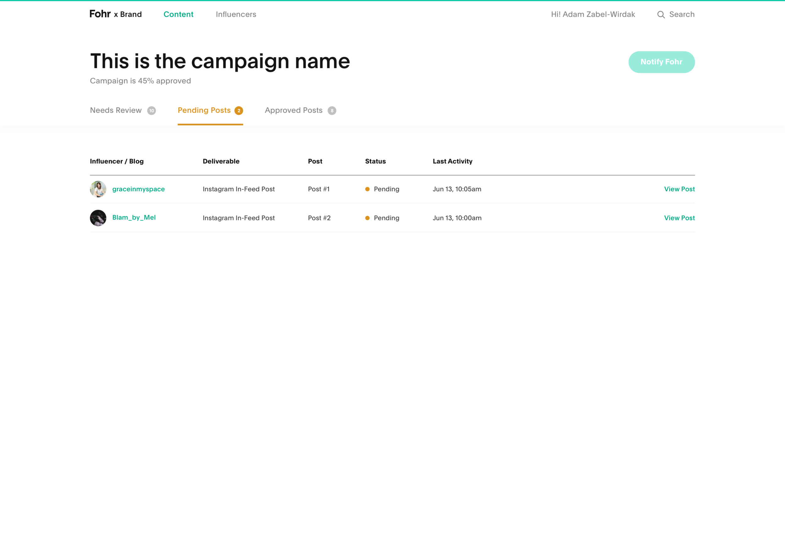
Old Design
Problems with old design:
No clear first actions
Difficult to know where to start (once the “Welcome back” modal is closed)
Not visual enough for a product that is so visually-focused
Proposed Theme 1: Gallery Format
Early designs
Gallery Format Final Design ~ Layout A
In this design, everything from the Status bar on the top-right to the Post component to the name of the web-app (Fohr: Campaigns or Fohr: “Brand Name”?) was iterated on. Our approach was a little bit of “throw everything at the wall and see what sticks”, since this was a complete UI overhaul.
Gallery Format Final Design ~ Layout B
Proposed Theme 2: Horizontal Stacks
I did not work on this theme, so have not included it here.
Proposed Theme 3: Dashboard
Proposed Theme 4: One-at-a-Time
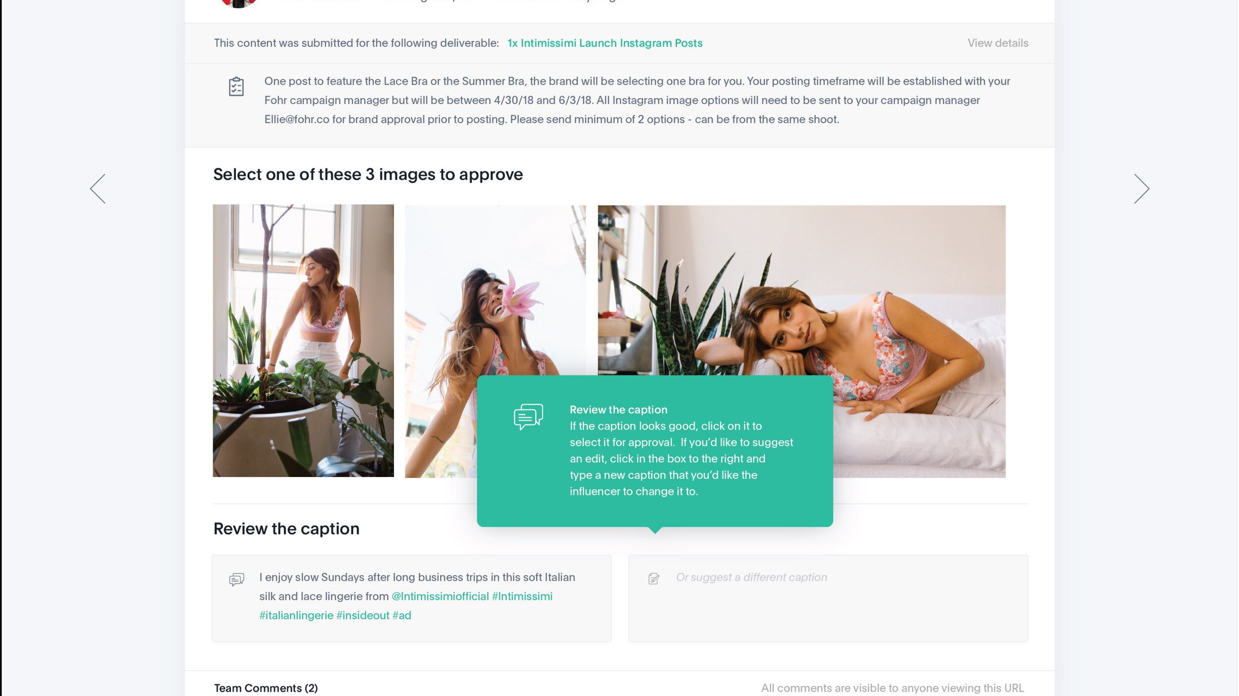
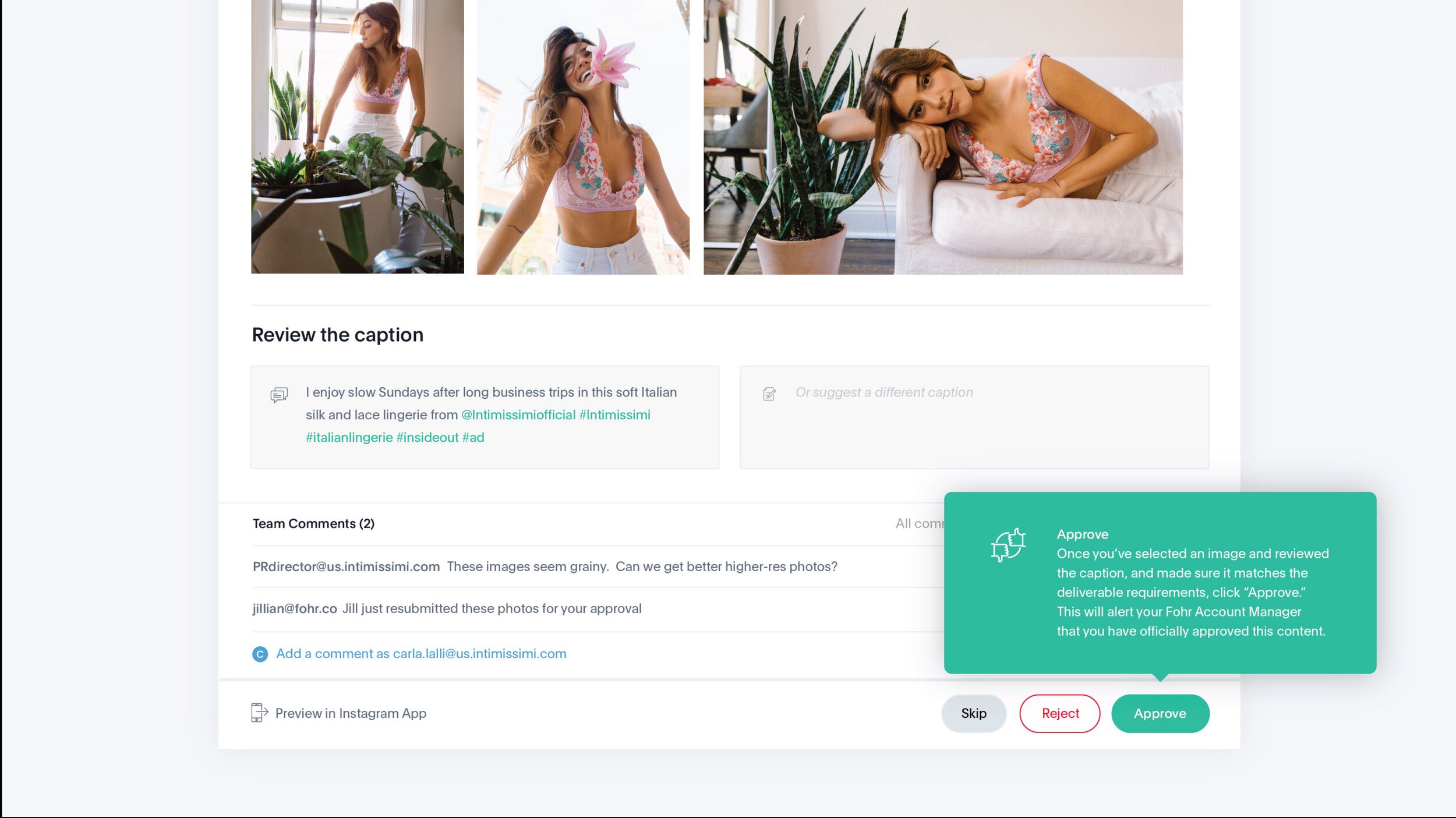
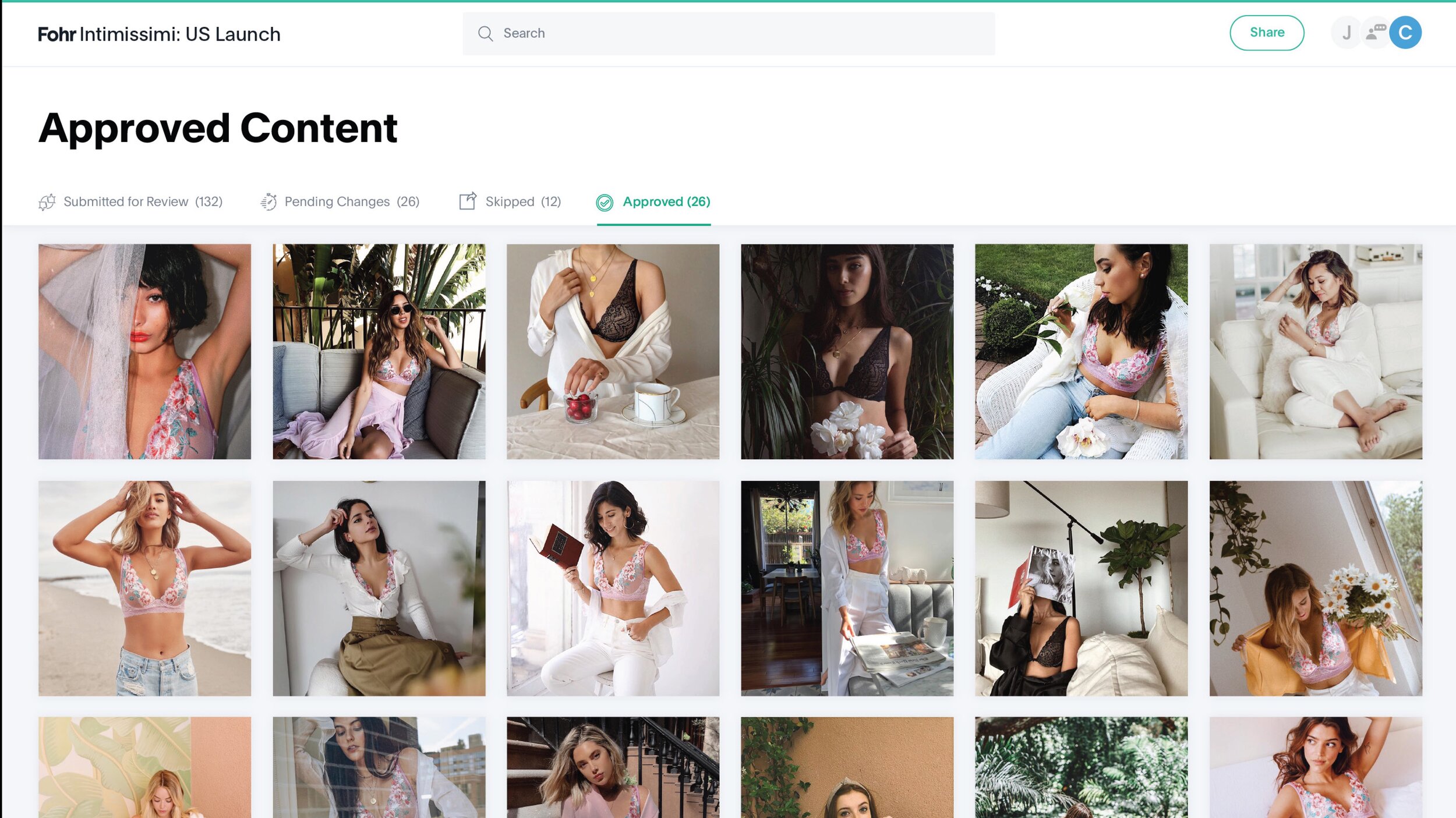
Chosen Design
The team loved both of these themes, and chose to combine them into one. Here is the final platform, designed.


