A revamp of Account settings & People management
During my time at Zipcar, I designed a complete revamp of the Account Settings and People management experience for business and family accounts. This included adding or redesigning features such as:
In the Web app
A member list better suited for large accounts (100’s of members)
Search for members
Add/remove members
Update roles of members
In the Mobile app
Account settings
A way to switch accounts
The Problem: We were migrating our site to a new, more user-friendly platform, and the Account Settings experience needed a redesign into the new platform’s design language. This was for all Business and Consumer users, including different variants of the UX for US and UK users. As always, a lot to consider.
In the same vein, we also needed to bring our Mobile app’s Account screen to parity with the Web app. It had very limited functionality, and it was high time we brought that up to speed.
Note: This page is best viewed on Desktop. It includes embedded Figma prototypes which may crash on mobile.
Company: Zipcar
Timeline: (from wire-framing to dev handoff)
Account Settings: 1 month
People Management: 3 months
Team: 1 main designer (myself), and 1 design manager.
People Management – Process
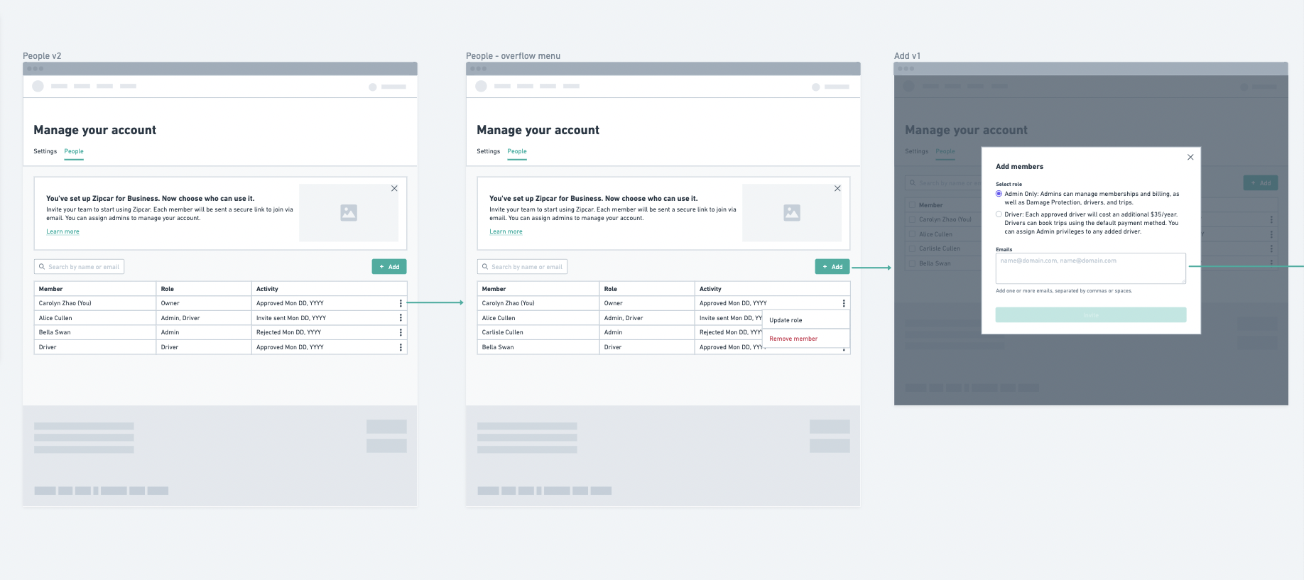
I started on the People management UI for the web view first. Since it would be a new tab on the Account Settings screen, it was easy to start the general layout. Leveraging existing components, I wireframed in a tool called Whimsical. In this stage, I also referenced companies with similar UI such as Uber business, Lyft family accounts, Google/Youtube accounts, and more.
Since many components were already in the design system, we were able to quickly wireframe some layouts, review them with stakeholders, and move on to hi-fi designs. Here, I was exploring the table view, add functionality and different variations of a welcome banner.
Wireframes
High-Fidelity Design Phase
After wire-framing, I moved on to hi-fi designs and explored variations of the welcome banner, Add member modal, and table.
Welcome Banner Design Exploration
Note: there are 2 different visual styles since we were in the middle of an illustration re-brand at the time. The final version of this has confetti for a celebratory feel, and phones replaced the keys to discourage the idea of using keys (mobile unlock works better with our cars). I also created a version for Consumers featuring our University student characters to match the user demographic.
Filtering
Nice-to-have, but De-scoped
Multi-Select Explorations
Removed due to complexity of different members’ options (according to role) and minimal perceived value
Add member modal
Previous tab exploration
We found that there were several user-types to consider: Owner, Driver, Admin, and Admin + Driver. Thus, the tab design did not work. Radio buttons were tried as well, but added unnecessary space on the modal with the 4 options.. The checkbox design won for its simplicity.
People Management – Final Design
Business accounts
After several rounds of feedback from the design team, the Engineering leads, and my Product manager, this is the result! Below is a prototype of the People management experience for Business accounts. For all of the below flows, I delivered mobile and UK designs as well, which have different spellings, date formats, and custom requests.
Tip: View in full screen by clicking the icon on the top right.
People Management – Internal Tool Design
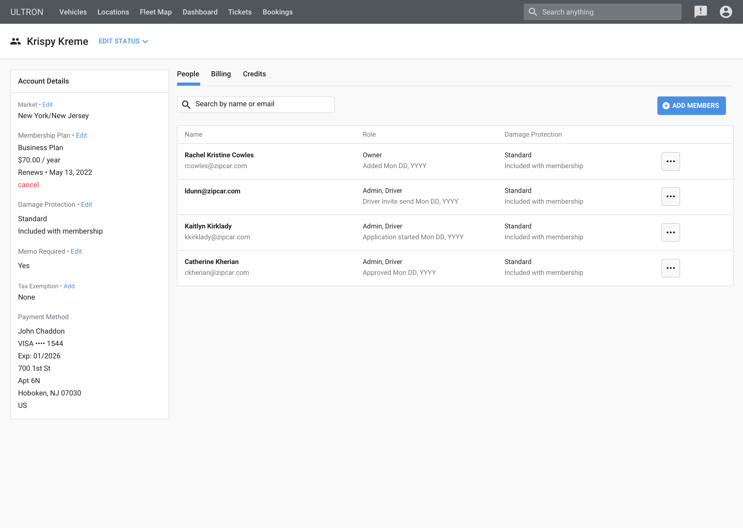
As with all projects at Zipcar, there is an internal platform to consider as well. Our internal tool that Customer Service agents use to help members is called Ultron. Ultron’s functionality needs to always mirror (sometimes surpass) those of our member-facing app. I designed the Ultron side of this project, which includes all the new features on the Account management pages, whether they’re a Consumer, a Business account, or a Custom Business account. This helps Customer Service agents help complete a task for anyone who calls in.
Consumer accounts
Going back to the Member-facing side, Consumer accounts looked very similar, just with less features than Business accounts. First of all, there’s a different illustration showing younger city-dwellers – students, yuppies, millennials.. any of the above. Those are our main demographic in our consumer sector. There are also no admin users here, so the Add member flow and options for each member look different.
There is no need to update roles or choose role when adding a member. Updating damage protection is on the member level, instead of on the account-wide level on Business accounts.
App Account Settings – Process
Jumping into the app side of things, here are some designs during the exploratory phase. For this project, the layout wasn’t extremely complex, so we were able to jump into hi-fi designs using components from the design system. Below are some header and Account page layout variations.
App Account Settings – Final Design
Note: Some of this prototype are additional features I designed but hadn’t made it to production.
Components made
Contributing to our design system is always part of the work as designers at Zipcar, as we have no design system designers. As part of these projects, I added a number of new components.
iOS / Android header
Web Message Banner
Web Radio Button
Web Search Bar (Variation of Input field)
Goals & Impact
Web Account Settings + People Management: The goal was mainly just to complete this on time (which it was 🥳). It was required for the company to complete their move to the new platform, which had been a huge, multi-year process. This was the last piece of the puzzle, so it was great to help get it over the finish line.
Mobile App Settings: The goal was to decrease calls to our Member Services Center by 90% within 3 months of release.
We saw a decrease from 0.12% to 0.01%, so 90%. This may feel like very low to begin with, but Zipcar get 1000’s of calls/day, so it does add up. It amounts to about 600 calls decreasing to about 50 calls per day. Each call not made is $4–10 saved, so that brings in about $66k / month post-release.
We also track how members use it on Fullstory, a user-research service, and see that members are successfully updating personal info.
All in all, it was great to achieve our goals completely with both these projects, and the team continues to monitor it to make sure everything is always working smoothly.


